Matte canvas usually reduces distracting reflections, glossy canvas offers a more reflective presentation, and satin provides an intermediate sheen. The best choice is the finish that keeps the important parts of your image visible in the intended setting—after printing and any protective coating.
That last condition matters. A roll sold as matte can become a satin or glossy finished print after varnishing. A glossy print can show convincing dark tones from one position and lose their detail in a reflection from another. Two satin canvases can also look different despite carrying the same finish label.
For print studios and canvas buyers, a useful matte vs glossy canvas comparison must connect three things: the supplied surface, the completed print and the viewer’s position. Here is how to compare them without confusing one effect with another.
Matte, Satin and Glossy Canvas: What Actually Changes?
Gloss describes directional surface reflection. Matte does not mean that a surface reflects no light; it generally produces less pronounced mirror-like reflection. A glossy finish produces a stronger directional reflection. The angle between the light, surface and viewer therefore matters. Rhopoint’s explanation of gloss and reflection provides the underlying measurement principles.
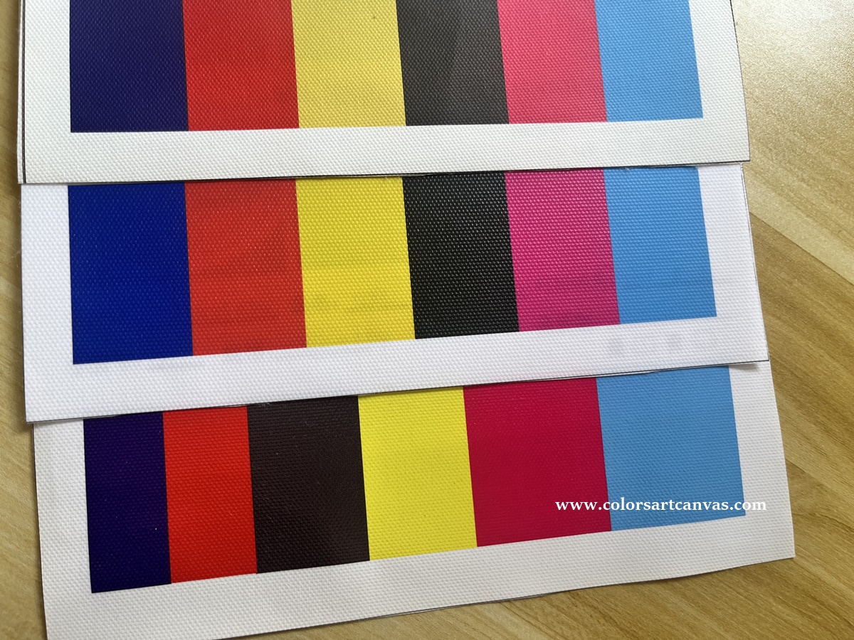
Printed canvas samples for comparing surface appearance, color patches and weave texture.
| Finish | What the viewer usually notices | Useful starting point | What the label cannot tell you |
|---|---|---|---|
| Matte | Low sheen; fewer distinct reflections competing with the image. | Artwork seen from several positions or sold for installations you cannot control. | Whether dark tones separate well, or whether the printed surface is uniform. |
| Satin | A gentle sheen that becomes more noticeable as the viewing angle changes. | Images that benefit from some sheen while still requiring comfortable viewing. | How close this particular satin is to matte or gloss. |
| Glossy | A stronger reflective appearance; potentially rich-looking dark and saturated areas away from glare. | A deliberate glossy presentation with suitable lighting and viewing positions. | Whether the apparent depth survives reflections on the actual wall. |
These are starting points, not fixed rules that portraits require matte or landscapes require gloss. Choose using the image’s important features and the finished surface.
Why Can Glossy Canvas Look Blacker but Show Less Shadow Detail?
Separate black depth from visible shadow detail. Black depth concerns the darkest part of a print under specified evaluation conditions. Shadow detail concerns whether neighboring dark tones remain distinguishable. A single impressive black patch does not answer both questions.
Surface appearance can change perceived color: X-Rite illustrates how matte and glossy samples of the same underlying color can appear different. This is why a visual comparison and a color measurement do not necessarily answer the same question. See X-Rite’s discussion of specular-included and specular-excluded measurement.
For canvas selection, apply that distinction this way: examine a dark photograph away from a direct reflection, then view it where the light source becomes visible on its surface. Check whether a dark jacket still separates from its background, or whether branches remain visible in a night sky. The glossy sample may be your preference in the first position but unsuitable in the second.
A matte sample that looks slightly less deep at first glance may preserve the subject more comfortably across the viewing positions that matter. Conversely, a glossy sample may be the right choice where reflections miss the image’s important areas.
Do not judge this only by room brightness. A relatively dim room can still contain a small, bright lamp reflected directly into the viewer’s eyes. A brighter room may have a wall position where the main reflection does not reach the viewer.
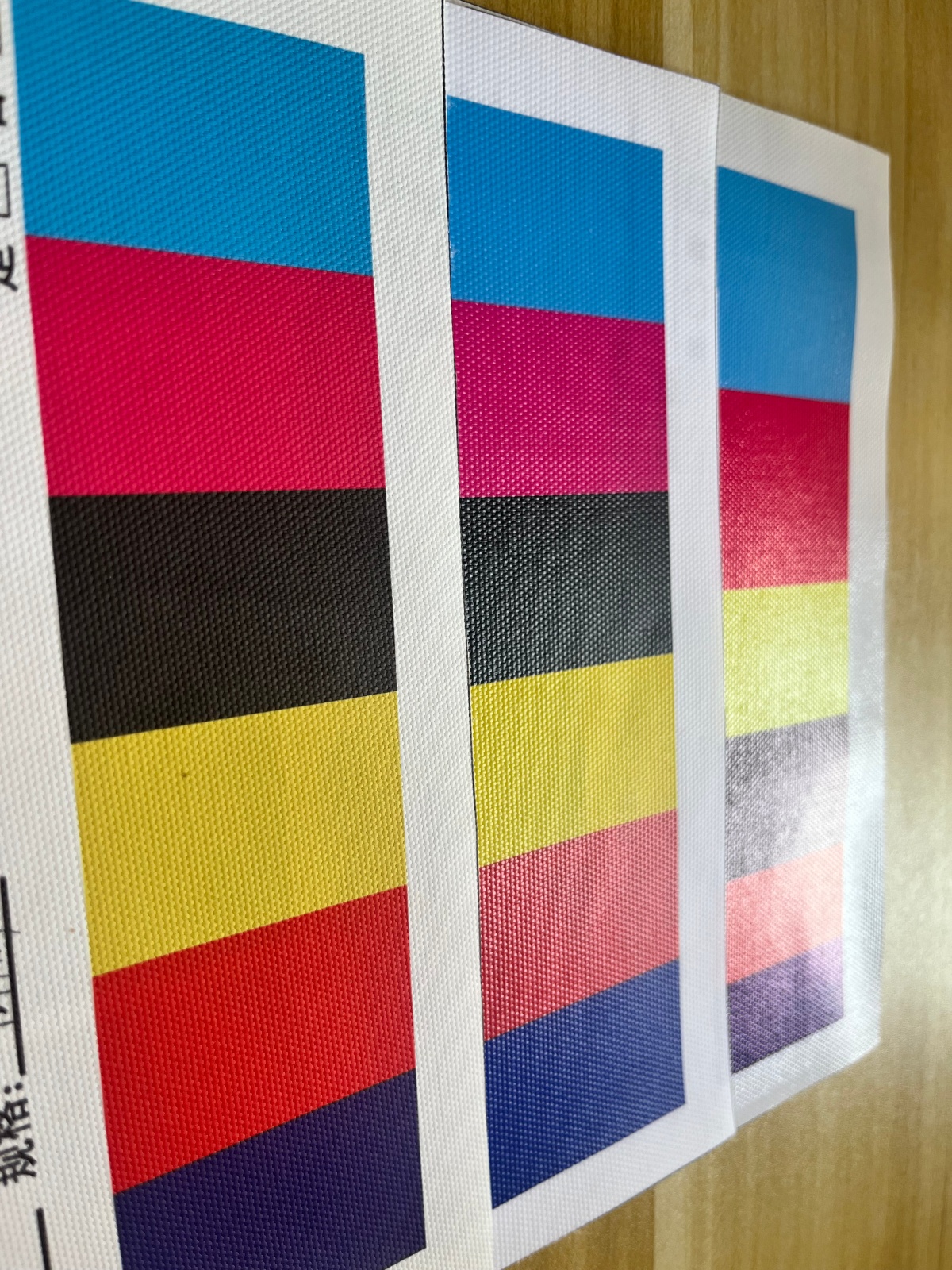
Surface reflections can make black and colored areas appear lighter from certain viewing positions. Compare samples both within and away from the reflection
Compare Three Surface Stages, Not Just the Blank Roll
Ask what “matte,” “satin” or “glossy” describes in the quotation. There are three different stages:
- Supplied canvas: the fabric and ink-receptive coating before printing.
- Printed canvas: the surface after ink application and the required drying or curing.
- Finished canvas: the customer-facing surface after any varnish or protective treatment.
Ink deposition and curing can affect reflection. Canon explains this for its printing technologies, including a UVgel system that creates matte and glossy effects by changing curing timing. This is a specific technology example—not a claim that every printer or canvas offers that control. Canon’s technical explanation shows why print-process settings can affect finish.
Post-print coating is another separate influence. Hahnemühle offers canvas varnish in matte, satin and glossy versions and describes changes to black and color appearance for its intended ink-and-canvas applications. See Hahnemühle’s canvas varnish information. Compatibility and results must be checked for the actual materials being used.
The practical consequence: comparing an unvarnished matte print with a varnished glossy print evaluates two complete production routes. It does not isolate the effect of the original canvas finish.
Two Comparisons That Answer Different Questions
| Question | Suggested comparison | How to interpret it |
|---|---|---|
| Which supplied canvas suits our printing? | Print the same file on the candidate canvases, each with appropriate settings. Compare before optional varnish. | This compares printable products. If their fabrics, coatings or weights differ, do not attribute every difference to sheen. |
| Which final sheen should our product have? | Make identical prints on one compatible canvas. Retain one reference and finish the others with compatible matte, satin and glossy varnishes. | This compares finishing routes on that canvas. It does not establish the performance of every factory-coated matte or glossy canvas. |
This separation helps identify what needs changing. If the preferred appearance emerges only after varnishing, record and approve that finishing route as part of the product.
Why Two Satin Canvases Can Still Look Different
Satin describes a visual range, not one universally interchangeable product. Two samples can differ in sheen strength, weave relief and the sharpness of their reflections.
Rhopoint demonstrates that surfaces with the same gloss reading can look different because gloss alone does not describe texture and haze. Its examples concern coated surfaces generally, not a performance test of printable canvas. See why a gloss value alone does not describe appearance.
For woven canvas, our suggested application is to inspect both the broad reflection and the pattern of highlights across the weave. Rotate the sample by a quarter turn while keeping the lamp and viewer stationary. Record whether the appearance changes with orientation. This is an observation check, not proof of a defect.
If a supplier provides gloss units, request the measurement angle and whether the reading comes from blank, printed or varnished material. Rhopoint describes different geometries for different gloss ranges. Measurement geometry must be specified. A bare number is not a complete specification, and general glossmeter ranges should not be treated as automatic canvas acceptance limits.
Do Not Confuse Overall Sheen with Uneven Sheen
A satin or glossy surface can be consistently reflective, or its reflection can vary between image areas. Those are different observations. Inspect an unprinted margin, a pale area and a dark area together while tilting the print. Note any abrupt change in sheen, even if the colors look acceptable straight on.
Canon’s discussion of ink layers and reflection helps explain why the blank surface alone cannot predict the entire printed appearance. It does not establish that a particular canvas will develop uneven sheen. Treat the inspection as a way to evaluate your actual sample.
Repeat the observation after any planned varnish. Breathing Color describes varnishing as a step that can alter black density and color saturation on compatible canvas prints. Its canvas varnish guide is useful background, but a topcoat should not be assumed to correct every surface problem.
A Five-Zone Proof for Choosing Matte, Satin or Glossy Canvas
The following is our proposed comparison method for this guide. It is designed to make sample discussions more specific; it is not a standardized laboratory test or a report of measured Colors Art results.
Build one proof containing these five areas, then print it on every candidate using the appropriate media setup and color-management workflow:
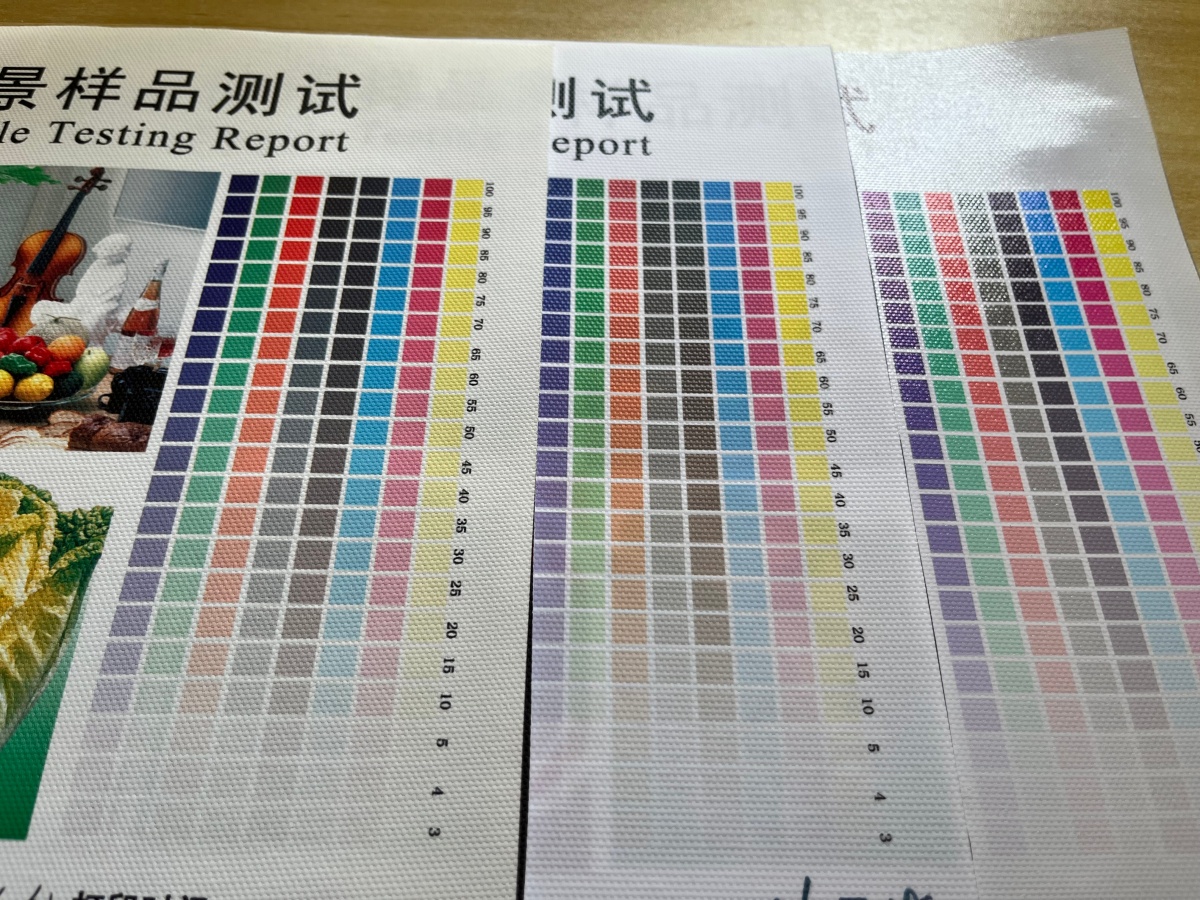
Example canvas test charts showing color and tonal steps. Use the table below to build a complete five-zone proof.
| Proof area | What to include | Decision it helps you make |
|---|---|---|
| Dark detail | A dark subject plus a gradual transition from black into gray. | Do you prefer the depth, and can you still distinguish the shadows? |
| Portrait | A face with highlight and shadow detail. | Does a reflection interrupt the part of the image viewers look at first? |
| Saturated color | Representative strong colors from your normal artwork. | Does the added sheen improve the intended presentation? |
| Quiet midtone | A broad neutral or softly colored area. | Does surface sheen or the weave distract from an otherwise simple image area? |
| Unprinted border | Exposed canvas beside pale and dark printed patches. | Is there a distracting change in sheen across ink coverage levels? |
Allow the specified drying or curing time. Compare the proofs under consistent evaluation light, then put them upright at the intended display height. Swap their positions so one sample is not permanently favored by the lighting.
Record Visibility from Three Real Viewing Positions
Mark a normal central viewing position and two realistic positions to its left and right. Keep the artwork and lighting fixed. At each position, record three observations: Are important details clear? Is the surface appearance acceptable? Is the sheen sufficiently uniform?
Use “clear,” “partly obscured” or “obscured” for visibility, and identify the affected image area. Repeat under the second lighting condition that matters to the project, such as evening lamps. Use the same positions for every finish.
Avoid averaging away a critical failure. If the portrait’s face disappears in glare from the main seating position, excellent appearance from two less-used positions may not compensate. Decide which positions matter before choosing the preferred finish.
Choose the Finish According to What the Comparison Reveals
- Choose matte when maintaining visibility across the required positions matters more than adding sheen, provided its printed dark detail and color meet your expectations.
- Choose satin when the actual sample adds the desired surface character while passing the same visibility checks. Do not select it merely because it sounds like a compromise.
- Choose glossy when its reflective presentation improves the artwork and the important image areas remain visible under the planned lighting.
For example, a dark landscape intended for a known feature wall may favor gloss if its tonal detail stays clear from the main viewing positions. The same image sold for unknown home installations may justify a lower-sheen option. These are decision examples, not measured rankings of the three finishes.
Frequently Asked Questions
Is matte canvas always better for black-and-white prints?
No. Compare the separation of dark tones and the effect of reflections. A glossy black-and-white print can work well in a suitable setting; matte can be preferable where viewing positions and lighting vary.
Can matte canvas become glossy after varnishing?
A compatible gloss varnish can change the final sheen of a matte canvas print. Approve the completed combination, including its appearance and suitability for the intended handling.
Is satin canvas the same as semi-gloss?
The names can overlap in supplier descriptions, but they do not guarantee matching surfaces. Compare finished samples and retain the approved reference.
Can a photograph show the true difference between the finishes?
One photograph records one lighting and viewing arrangement. For remote approval, include a fixed front view and a short movement through the relevant viewing positions, with exposure and lighting held constant. Use physical samples for the final finish decision where possible.
Compare Canvas Finishes with Colors Art
Start with our matte aqueous printable canvas range, or ask about suitable matte, satin and glossy canvas samples. Tell us your printer and ink system, the appearance you want and whether the prints will receive a protective finish.
For material and ink compatibility, read our inkjet canvas guide. For this finish decision, keep the approval focused: the same representative artwork, the complete finishing process and the viewing positions your customers will use.